top of page

Architecture, Art and London. Notes from the city.

A personal note on the Brutalist architecture of London


I've been meaning to write this for a while, well- before I forget these gems I had cycled past more than a decade ago during my 9-5 era and also partly because I think they deserve better than a glance.


I grew up in Mumbai, a city that doesn't really do quiet or polished. Concrete there isn't precious, it's just what things are made of, and buildings wear their age openly: water stains, cracked render, wiring running along the outside because that was the easiest place to put it. I think that's where my pull toward gritty, honest architecture started. I never had much patience for buildings that try too hard to charm you. I like the ones that just tell you what they are.


That's probably why, when I moved to London, it was the Brutalist buildings that stopped me in my tracks rather than the postcard ones. And it turns out a huge number of the best examples, the odd, unfussy, slightly unloved ones, sit right here in South London.


Charing Cross Hospital


Brutalist London Charing Cross Hospital black and white

The commission came from Imperial College's brand team, which gave me a proper excuse to spend time with a building I'd only ever half noticed from a bus window before. Up close, it's enormous. The balconies stack and repeat all the way up, and there's a small clock set into the brick facade near the entrance that I found strangely moving, a tiny, human detail on a building built at an almost inhuman scale. I ended up circling the whole site more than once trying to find the angle that captured that scale honestly. The one where the corner cuts sharply against the sky is the one that stuck.


Stockwell Bus Garage


Vintage photo Brutalist Stockwell Bus Garage

This one is genuinely a cathedral, and I mean that without exaggeration. When it opened in 1952, it had the largest unsupported roof span in Europe, a fact that still gets people (Will Self among them) calling it the most important building in London. It came out of a steel shortage, so the architects turned to concrete instead, and the result is this vast, calm, glazed hall that still holds two hundred buses. The garage wasn't directly on my route to work, but as soon as I got to know about it, I had to take detour from Clapham road to admire it in real life.


Peckham Rye Car Park


Brutalist London Peckham Rye car Park. Black-and-white photo.

This started as a commission for a clothing brand launching at the newly refurbished 'Peckham Levels' in what was originally a brutalist multi storey car park. I have a soft spot for this one because it refuses to sit still in its own history. Now it's an open air gallery and one of London's best kept summer secrets, with views over the whole city from the roof. It's a good reminder that these buildings don't have to stay frozen as monuments. They can be reused, reclaimed, argued over, and loved in ways their original architects never planned for.


Brutalist Library, South Norwood

Brutalist London South Norwood Library

My Covid years in West Norwood. Long walks and bike rides to not lose my mind. This building is 100% miss-able if you weren't looking for it. Small, unassuming and nearly lost more than once. Designed by Hugh Lea and completed in 1968, it's often described as a "Mini Mies," all glass and clean geometry, dropped into an otherwise Victorian high street. It nearly closed a few years ago before a local campaign, led by residents who clearly loved it as much as I do from the outside, fought to keep it open. It's one of those buildings that proves Brutalism was never really about scale. Sometimes it's just about being honest with a small budget and a good idea.


Lambeth Towers


Brutalist London Lambeth towers George finch

This is the one I whizzed past almost daily on the way into work. Designed by George Finch in the 1960s and completed in 1972, its ten storeys of cranked concrete stack irregularly so that every maisonette gets its own balcony and dual light. Finch was a committed socialist who believed architecture could genuinely improve people's lives, and you can feel that intention in the building. It's not trying to impress you from a distance. It's designed for the people living inside it, which I think is the whole point of Brutalism that so often gets lost when people only see the concrete and stop looking.


Brixton Recreation Centre


Brixton Rec Centre Brutalist London

I almost left this one off the list, not because it's less interesting than the others, but because I know it so well I nearly forgot it counts as something to notice. It was George Finch's last project for Lambeth, designed in the early 1970s and not completed until 1985, and it was finally given Grade II listing in 2016, decades after most people had already decided Brutalism was something to be embarrassed about rather than proud of.


I don't live in the area anymore, but pass it often it from the train from Bromley on the stretch coming into Brixton, where the facade rises up on the left. There's something about catching it from a moving train, half distracted, half looking at my phone and still having it register, that tells you a building is doing something right. It's not a subtle structure. As a graphic designer I love the bold signage on it as well, like it's been designed with intention for this particular structure alone. Sitting in the middle of Brixton, still in daily use, still full of people swimming and playing basketball and going about ordinary life inside it, it feels like proof that these buildings were never meant to be admired from a distance. They were meant to be lived in and used, and Brixton Rec still is.


Brutalist London Elephant and Castle

None of these buildings are asking to be beautiful in the conventional sense. They're asking to be looked at properly, maybe for the first time in years. That's probably why I loved illustrating this series, and will always be looking to add to these (suggestions welcome!). My illustrations of Brutalist London architecture can be found here.


Pride in London March in Oxford Street
Pride in London Underground Stations

Every June, London's streets burst into colour. Pride flags appear in shop windows, community centres, offices and homes. They are symbols of visibility, acceptance and the simple but powerful belief that everyone deserves to be seen for who they are.


For me, Pride has always represented something larger than sexuality or gender identity. It represents belonging.

It says: there is space for you here. Whether you were born in Brixton or Bangalore. Whether your family has lived in Britain for generations or you've just arrived. Whether you're gay, straight, trans, queer, questioning or simply trying to find your place in the world. There is space for you here.


Lately, though, I've noticed something that makes me a bit sad. Across parts of Britain and beyond, Pride flags are quietly disappearing from public spaces. At the same time, we've seen a resurgence of national symbolism, with St George's flags becoming increasingly prominent. Now, I have absolutely nothing against the St George's flag. National identity and cultural pride matter. They should be celebrated. But I don't believe these symbols need to compete with one another. One of the things London taught me is that pride isn't a finite resource. Celebrating one identity doesn't diminish another. A city can be proudly English and proudly diverse.


Kings Cross London Pride
Barbican London Pride Art Prints

The best versions of London have always understood this. That's partly what inspired my Pride in London print series. I wanted to reimagine some of London's most recognisable landmarks through the colours of Pride. Not as political statements, but as celebrations. Celebrations of visibility, diversity and the wonderfully varied people who make this city what it is. The prints are colourful because London is colourful.


When I think about inclusion, I often think about Brixton. Brixton has long been one of London's great stories of migration, culture and reinvention. It's a place where communities from around the world have shaped the character of a neighbourhood while preserving pieces of their own heritage. That's why one of my favourite illustrations is my Brixton print, where the market is draped with the flags of many nations. To me, those flags don't represent division. They represent contribution. They tell the story of people who arrived from somewhere else and helped create the Brixton we know today. Every flag represents a journey. Every flag represents a family. In many ways, that's my story too.


Brixton Village London Diversity Print
Brixton Market London Diversity Art Print

It's also the idea behind another collection that is particularly close to my heart- Migrants of London.

The series celebrates the migratory birds that arrive in Britain every year from across Europe, Africa and beyond. Birds don't carry passports. They don't apply for visas. They don't stop at borders. They simply arrive. Drawn by instinct, seasons and survival. And every year, Britain welcomes them. Nature doesn't see migration as a threat. It sees it as part of life.


Their journeys enrich our landscapes. Their presence is celebrated. The city becomes more vibrant because they are here. When I created the Migrants of London series, I wasn't trying to make a political statement. I was trying to tell a story about movement, connection and shared space. The more I think about it, the more connected these projects feel.


Migrants of London Art Print
Migrants of London Art Print celebrating Diversity


Especially now, when conversations around identity can feel increasingly polarised, I think it's worth remembering that inclusion isn't about choosing one flag over another. It's about making room for more flags. That's something worth celebrating during Pride Month.


And it's something worth celebrating every month of the year.


Pride March in London


I’ve walked to both stadiums more times than I can count. Sometimes on match days to the Emirates, sometimes just passing through the old Highbury stadium with a sketchbook in my bag. What always strikes me is how different the experience feels before you even step inside.


The walk to the Highbury stadium feels quiet, almost hidden. You turn a corner from a residential street and suddenly you’re face-to-face with something that doesn’t quite belong to the everyday rhythm of the city.

On the other hand, the approach to the Emirates Stadium is opposite! You see it from a distance. It announces itself early... all curve, scale, and movement. Both belong to Arsenal F.C. but architecturally, they feel like two completely different worlds.


Arsenal Highbury Stadium. Quiet Details and Human Scale.

The first time I properly stopped at Highbury, I wasn’t even thinking about football. I was looking at the façade.

The East Stand has this stillness to it. The symmetry, the vertical lines, the Art Deco detailing... it feels deliberate in a way most stadiums don’t. I remember standing across the street trying to sketch it quickly, but getting caught up in the small details instead. The lettering, the proportions, the way the entrance frames the space.


There’s something about the scale that makes it approachable. You don’t feel dwarfed by it. It sits within the street, almost politely. Even now, with the stadium converted into housing, that façade still holds its presence. It feels like a memory that hasn’t fully moved on.


Arsenal Highbury Stadium

The Emirates Stadium. Movement, Curve, and Scale.

The Emirates feels completely different before you even get close. You don’t arrive at it, you approach it.

Walking up from Holloway Road, the structure slowly reveals itself. First the upper edges, then the curve, then the full bowl. I remember taking photos the first time I circled it properly...not of the whole building, but of sections. The steel supports, the repeating patterns, the way light hits the surface differently depending on where you stand.

It’s a building that changes as you move around it. Where Highbury is about composition, the Emirates is about flow. Even sketching it feels different. At Highbury, you focus on symmetry. At the Emirates, you’re trying to capture motion and scale, which is much harder to pin down on paper.


Arsenal Emirates Stadium

Two Stadiums, Two Atmospheres

What surprised me most wasn’t just how they look, it’s how they feel. At Highbury, everything happens close together. The streets, the entrances, the structure. It all builds a sense of compression. Even without a crowd, you can imagine the intensity. At the Emirates, everything expands. The open spaces, the wide walkways, the scale creates distance as much as it creates presence.

I once walked around the Emirates early in the morning when it was completely empty. No fans, no movement — just the structure. It felt less like a stadium and more like a piece of infrastructure. Something designed to handle scale, rather than intimacy.


Sketching the Contrast.

When I started turning these spaces into prints, the differences became even clearer.

Highbury naturally lends itself to symmetry, framing and detail. You can almost centre it and let the architecture do the work.


Highbury Stadium Art Deco facade London
Early Highbury Sketches

The Emirates is harder. You have to choose a moment- a curve, a shadow, a repeating structure. It’s less about capturing the whole building and more about capturing how it feels to move around it. That contrast is what makes them so compelling to draw and why they work so well as a pair.


Emirates Stadium exterior architecture London
My initial outline for the Emirates Print

Over time, I’ve come to see them less as “old vs new” and more as two different ways architecture responds to culture.

Highbury reflects a slower, more embedded relationship with the city whereas the Emirates reflects scale, efficiency, and modern expectation


Neither replaces the other. They just exist at different points in the same story.


Explore Prints and more


Arsenal Emirates Stadium Art Print

If you’re drawn to these buildings in the same way, I’ve created a set of Arsenal Stadium Art Prints that capture both Highbury and the Emirates. They’re designed to reflect the contrast between the two from Art Deco detail to modern structure, and to work as a series.


Arsenal Stadium Art Prints Bundle – Emirates & Highbury London Wall Art
From£11.00
Buy Now

Arsenal FC Stadium Coasters
From£6.00
Buy Now
Arsenal Highbury Tough iPhone Case
£24.00
Buy Now
Arsenal FC Heritage Ceramic Mugs. Arsenal Highbury.
£15.00
Buy Now
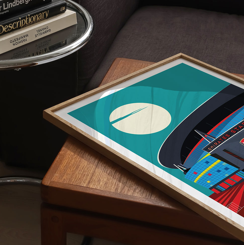
Moonlit Beauty. The Arsenal Stadium Illustrated Art Print
From£10.00
Buy Now


Subscribe

Get in touch

mathanki@eyeforlondonprints.com


Mirror Maker Studios trading as

Eye for London Prints,

Clarebank, Logs Hill BR7 5LW

Sustainability

We make a monthly donation to Trees for the Future. Planting trees provides families with more than just food. It provides income, empowerment, unity, leadership, education and even saves lives. Every year, over 30 million trees are felled intentionally and by natural causes.


Trees For The Future is a non-profit organisation that has planted 200 million trees. 

Quick links

  • Eye for London Prints Instagram
  • Eye for London Prints  Facebook
  • Eye for London Prints Twitter
  • Eye for London Prints YouTube
  • Eye for London Prints TikTok
bottom of page